

Overview
One website. Every screen. Zero compromise.
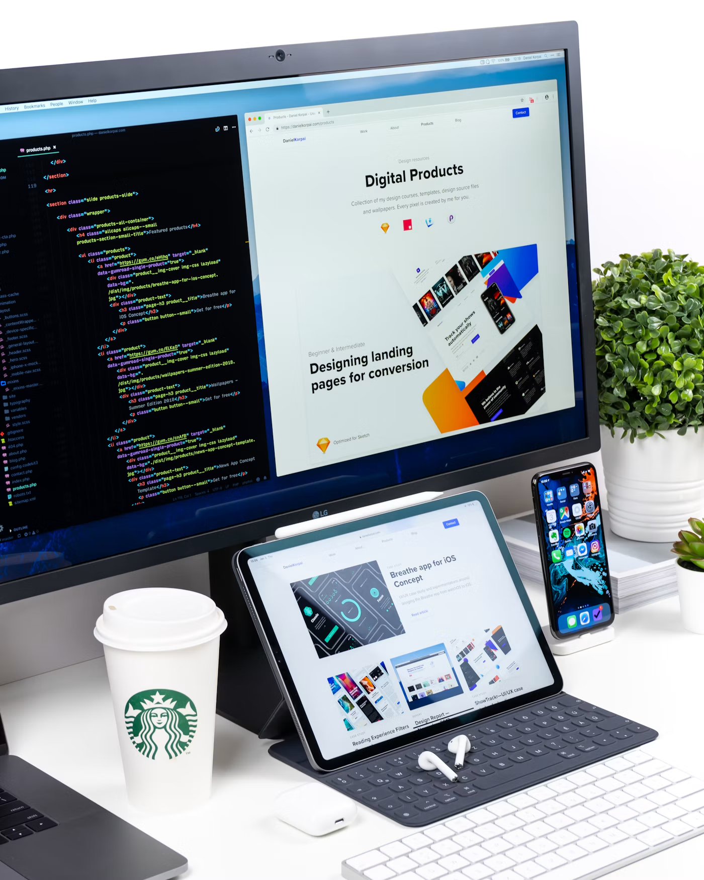
More than half of web traffic now arrives on a phone, and visitors leave quickly when a page is slow, cramped or hard to tap. At JDK Web Solutions we design mobile-first, then scale up gracefully to tablets, laptops and large displays, so your brand looks intentional wherever it is seen.
Our responsive builds use modern CSS, fluid grids and optimised media, which means faster load times, better search visibility and higher conversion rates — without maintaining separate mobile and desktop sites.
- Mobile-first design approach
- Fluid grids & flexible images
- Cross-browser & cross-device testing
- Touch-friendly navigation
- Core Web Vitals optimisation
- Accessibility best practices
What We Deliver
Responsive design, done properly
Mobile-First Layouts
We start with the smallest screen and enhance upward, so the essentials always come first.
Fluid Grids & Breakpoints
Flexible layouts that reflow naturally at every width instead of snapping awkwardly.
Cross-Browser Compatibility
Consistent rendering across Chrome, Safari, Firefox and Edge on all major devices.
Touch-Friendly Interfaces
Comfortable tap targets, sensible spacing and gestures that feel natural on touchscreens.
Speed & Performance
Optimised images, lazy loading and lean code for a fast first paint on slow connections.
Accessible by Design
Semantic markup, colour contrast and keyboard support that make your site usable by everyone.
Our Process
How we take your project from idea to launch
Audit & Goals
We review your current site, analytics and audience devices, then define what success looks like.
Wireframes & Layouts
Mobile, tablet and desktop wireframes show how content flows at each screen size.
Visual Design
Typography, colour and imagery are designed to scale elegantly from phone to widescreen.
Build & Cross-Device Testing
Hand-coded, lightweight pages tested on real devices and browsers before launch.
Launch & Monitor
We go live, track performance and Core Web Vitals, and fine-tune what the data shows.
Technologies we use
The right tools for the job
Why JDK Web Solutions
Why choose JDK Web Solutions for responsive design
-
Hand-coded, not template-based
Clean, lightweight code that loads quickly and is easy to extend.
-
Tested on real devices
Not just browser emulators — we check the screens your customers actually use.
-
SEO-ready foundations
Semantic structure and speed improvements that support search visibility.
Common Questions
Responsive Web Design — frequently asked questions
It means a single website that automatically adapts its layout, images and navigation to the screen it is viewed on — phone, tablet or desktop — instead of requiring separate versions.
In most cases, yes. We audit your current site and either retrofit responsive layouts or recommend a rebuild if the underlying code makes that more cost-effective.
Yes. Search engines index the mobile version of your site first, and fast, mobile-friendly pages tend to perform better and keep visitors engaged for longer.
We test on real phones and tablets as well as browser tools, checking layout, tap targets, performance and accessibility before launch.